Aimathic
Login | English | Deutsch

Free Math Worksheets

Build your own math worksheets from 21,000 problems for grades 3 to 12, from fractions to calculus. Every problem includes step-by-step solutions.

Misleading data displays

Click problems to add them to your worksheet.

5382186
Water temperature at an outdoor pool: <table><tr><th>Time</th><th>Temperature in °C</th></tr><tr><td>9 a.m.</td><td>\(19\)</td></tr><tr><td>Noon</td><td>\(22\)</td></tr><tr><td>3 p.m.</td><td>\(24\)</td></tr><tr><td>6 p.m.</td><td>\(21\)</td></tr></table> The values will be displayed in a bar graph. Should the vertical axis begin at \(0\) or at \(18\) so that the differences are not exaggerated? Decide and explain.

Hints

- Examine the scale as well as the bar heights. - Check whether the starting point and maximum create a fair visual comparison.

Solution

1. Compare how the bar heights would look with each starting value. 2. If the vertical axis began at \(18\), differences of only a few degrees would take up most of the graph and appear much larger than they are. 3. Therefore, the vertical axis should begin at \(0\) to avoid exaggerating the differences.

Answer

The vertical axis should begin at \(0\). Starting at \(18\) would make small temperature differences appear much larger than they are.
5115576
Fifty students rated a new school library program: - \(8\) students: “Excellent” - \(15\) students: “Good” - \(17\) students: “Fair” - \(10\) students: “Poor” The library director wants to display exactly three groups so that the positive responses appear as the largest group. Only adjacent rating categories may be combined. How should the categories be grouped? Give each group a suitable name and state its number of students.

Hints

- Only neighboring rating categories may be combined. - Add the counts for Excellent and Good. - Compare that sum with each remaining category count.

Solution

1. The counts total \(8+15+17+10=50\). 2. Combine the two highest adjacent ratings: Excellent and Good have \(8+15=23\) students. 3. Leave Fair as a group of \(17\) students and Poor as a group of \(10\) students. 4. Since \(23>17\) and \(23>10\), the positive group is the largest.

Answer

Positive (Excellent and Good): \(23\) students Neutral (Fair): \(17\) students Negative (Poor): \(10\) students
5115586
An energy company publishes a bar graph of carbon dioxide emissions from its power plants over three years: - Year 1: \(100\) tons - Year 2: \(98\) tons - Year 3: \(95\) tons In the graph, the Year 3 bar appears less than half as tall as the Year 1 bar, even though emissions decreased by only \(5\%\). Explain precisely how the y-axis was changed to create this misleading impression. What should be changed to make the graph neutral?

Hints

- Compare the numerical change with the apparent change in bar height. - Consider what happens when the lower part of the y-axis is removed. - Bar lengths should be measured from a common zero baseline.

Solution

1. A bar graph compares values through bar heights. If the y-axis begins at \(92\) instead of \(0\), the visible height for Year 1 is \(100-92=8\) units. 2. The visible height for Year 3 is \(95-92=3\) units. 3. Since \(3\) is less than half of \(8\), the truncated axis makes the decrease look greater than one half even though the values changed only from \(100\) to \(95\). 4. The y-axis should begin at \(0\) so the bar heights accurately represent the relative sizes of the emissions values.

Answer

The y-axis was truncated; it begins above \(90\) tons, such as at \(92\), instead of at \(0\). This greatly exaggerates the small differences. A neutral bar graph should start the y-axis at \(0\).
5142646
A gardener measured rainfall on five consecutive days. <table> <tr><td><b>Day</b></td><td><b>Rainfall (inches)</b></td></tr> <tr><td>Monday</td><td>\(0.4\)</td></tr> <tr><td>Tuesday</td><td>\(0\)</td></tr> <tr><td>Wednesday</td><td>\(1.0\)</td></tr> <tr><td>Thursday</td><td>\(0.6\)</td></tr> <tr><td>Friday</td><td>\(0.5\)</td></tr> </table> a) Find the mean daily rainfall for these five days. b) Which y-axis range would display all the values clearly without wasting unnecessary space? Briefly justify your choice. - Range A: \(0\) to \(10\) inches - Range B: \(0\) to \(1.2\) inches - Range C: \(0.5\) to \(1.0\) inches

Hints

- Add the five measurements and divide by \(5\). - Identify the smallest and largest measurements. - A useful axis includes all values while keeping differences easy to see.

Solution

1. The total rainfall is \(0.4+0+1.0+0.6+0.5=2.5\) inches. 2. The mean is \(2.5\div5=0.5\) inch per day. 3. Range A is much larger than the data and would make the bars difficult to compare. 4. Range C cannot show the values \(0\) and \(0.4\). 5. Range B includes every value from \(0\) through \(1.0\) and uses the graph space effectively.

Answer

a) \(0.5\) inch per day b) Range B, from \(0\) to \(1.2\) inches, because it includes all data values and gives a readable scale.
5319356
A class survey asked students about their favorite free-time activities. Students could choose more than one activity. A student displayed the results in a circle graph. a) Find the sum of all percentages shown. Explain why a circle graph is not appropriate for data from a multiple-response survey. b) The sectors were drawn in proportion to the listed percentages, whose total is \(150\%\). What fraction of the entire circle does the Sports sector actually occupy? Write the fraction in simplest form.
Figure for problem 531935

Hints

- Add all percentages in the graph. - A complete circle normally represents \(100\%\). - For part b), compare the Sports value with the total of all displayed values. - Simplify the resulting fraction.

Solution

1. The percentages total \(50\%+35\%+45\%+20\%=150\%\). 2. A circle graph represents one whole, or \(100\%\). Because students could choose multiple activities, the percentages exceed \(100\%\), so the sectors cannot represent the stated percentages as parts of one whole. 3. In the drawn graph, Sports has \(50\) parts out of a total of \(150\), so it occupies \(\frac{50}{150}=\frac{1}{3}\) of the circle.

Answer

a) \(150\%\). A circle graph is inappropriate because multiple responses make the total exceed \(100\%\), while a circle represents exactly one whole. b) \(\frac{1}{3}\)
5350796
A sixth-grade class completed an interest survey about new after-school clubs. Students could select every club that interested them, so multiple responses were allowed. The bar graph shows the results. a) What percent of the students were interested in the soccer club? b) Find the sum of the percentages for all five bars. Why is the sum greater than \(100\%\)? c) The class has \(40\) students. How many selected the theater club? d) During final registration, \(18\) students choose robotics but only \(12\) choose soccer. Explain why this does not necessarily contradict the survey.
Figure for problem 535079

Hints

- Read the soccer bar from the y-axis. - Add all five percentages and consider the effect of allowing multiple selections. - Find \(35\%\) of \(40\) for the theater club. - Distinguish an expression of interest from a final commitment.

Solution

1. The soccer bar shows \(55\%\). 2. The percentages total \(40\%+35\%+55\%+20\%+10\%=160\%\). The total exceeds \(100\%\) because each student could select more than one club. 3. Theater was selected by \(35\%\) of \(40\), or \(0.35\times40=14\) students. 4. The survey measured nonbinding interest, while registration records final choices. Students may change their minds, and schedules, capacity limits, or other conditions may affect enrollment.

Answer

a) \(55\%\) b) \(160\%\). The sum is greater than \(100\%\) because multiple responses were allowed. c) \(14\) students d) Interest survey responses and final registrations measure different decisions, so the totals may differ.
5351036
The two graphs show the daily electricity production of a wind turbine over one week in megawatt-hours (\(\text{MWh}\)). a) Read each daily value from Graph 1. On which day was production highest, and on which day was it lowest? b) In which graph do the day-to-day differences appear larger? Explain how the y-axis scales create this effect. c) Find the mean daily electricity production for the week.
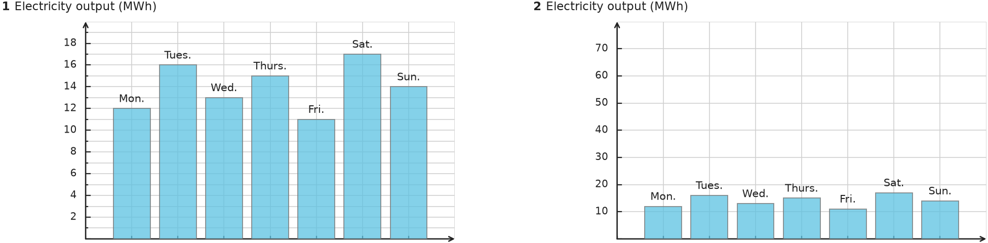
Figure for problem 535103

Hints

- Compare the y-axis maximum in each graph. - The data values are identical in both graphs. - Add all seven daily values before dividing by \(7\).

Solution

1. The values are Monday, \(12\,\text{MWh}\); Tuesday, \(16\,\text{MWh}\); Wednesday, \(13\,\text{MWh}\); Thursday, \(15\,\text{MWh}\); Friday, \(11\,\text{MWh}\); Saturday, \(17\,\text{MWh}\); Sunday, \(14\,\text{MWh}\). 2. Production was highest on Saturday and lowest on Friday. 3. The differences appear larger in Graph 1 because its y-axis ends at \(20\,\text{MWh}\). The same differences occupy a much smaller part of Graph 2, whose y-axis ends at \(80\,\text{MWh}\). 4. The weekly total is \(12+16+13+15+11+17+14=98\,\text{MWh}\). The mean is \(98\div7=14\,\text{MWh}\) per day.

Answer

a) Monday: \(12\); Tuesday: \(16\); Wednesday: \(13\); Thursday: \(15\); Friday: \(11\); Saturday: \(17\); Sunday: \(14\), all in \(\text{MWh}\). Highest: Saturday; lowest: Friday. b) Graph 1, because its y-axis has a much smaller range. c) \(14\,\text{MWh}\) per day

5116586
A sixth-grade class surveyed students about their favorite pets. The results were: - Dog: \(9\) votes - Cat: \(6\) votes - Hamster: \(3\) votes - Bird: \(2\) votes a) A bar graph uses a scale of \(1\,\text{cm}\) for every \(2\) votes. What is the difference in bar height between Dog and Hamster? b) What percent of all votes were for Cat? c) Someone suggests starting the y-axis at \(2\) votes to save space. Explain why this could misrepresent the results.

Hints

- Find the difference in votes, then use the graph scale. - Add all votes before finding the Cat percentage. - Think about what happens to a bar with value \(2\) if the axis begins at \(2\).

Solution

1. Dog and Hamster differ by \(9-3=6\) votes. At \(2\) votes per centimeter, the difference is \(6\div2=3\,\text{cm}\). 2. The total number of votes is \(9+6+3+2=20\). 3. Cat received \(\frac{6}{20}=30\%\) of the votes. 4. If the y-axis starts at \(2\), the Bird bar would have no visible height even though Bird received votes. The other differences would also appear larger than their actual proportions.

Answer

a) \(3\,\text{cm}\) b) \(30\%\) c) The truncated axis would exaggerate differences and make the Bird category appear to have no votes.

All problems may be used, copied and printed free of charge for school and tutoring, including paid tutoring. Commercial adaptations as well as publication or redistribution on the internet are not permitted.