Aimathic
Login | English | Deutsch

Free math worksheets

Build your own math worksheets from 30,000 problems for grades 3 to 12, from fractions to calculus. Every problem includes step-by-step solutions.

Scatter plots and association types

Click problems to add them to your worksheet.

5499848
A technician plots the day of the month against the last digit of a randomly generated access code. What type of association does the scatter plot show?
Figure for problem 549984

Hints

- Check whether large \(x\)-values tend to occur with mostly large or mostly small \(y\)-values. - Do not let one or two high points determine the description.

Solution

1. The points do not trend upward or downward as the day changes; high and low values occur throughout the x-range. 2. Therefore, the plot shows no clear association.

Answer

No association.
5499928
Which study would most appropriately use a scatter plot? a) Favorite music genre and preferred lunch b) Backpack color and bus route c) Hand span and height for each student d) Homeroom number and eye color

Hints

- Identify which option gives two quantitative variables. - Make sure the two measurements are paired for the same person or object.

Solution

1. A scatter plot requires two numerical measurements paired for each observation. 2. Hand span and height meet both conditions, so choice c) is appropriate.

Answer

c) Hand span and height for each student.
5501438
The scatter plot shows weekly reading time and quiz score for five students. a) Which variable is shown on the x-axis? b) What does the point \((2, 70)\) mean in this context?
Figure for problem 550143

Hints

- Read the label along the horizontal axis to identify the x-variable. - In an ordered pair \((x, y)\), match the first coordinate to the x-axis and the second coordinate to the y-axis.

Solution

1. The horizontal axis is labeled Reading time (hr), so weekly reading time is the x-variable. 2. The point \((2, 70)\) represents a student who read for \(2\) hours during the week and earned a quiz score of \(70\%\).

Answer

a) Weekly reading time. b) One student read for \(2\) hours during the week and earned a quiz score of \(70\%\).
5499828
The scatter plot shows practice time and free-throw percentage for several basketball players. Which description best fits the association: positive linear, negative linear, nonlinear, or no association?
Figure for problem 549982

Hints

- Look at the overall direction from left to right, not each individual point. - Decide whether a straight band or a curve better describes the pattern.

Solution

1. The points generally rise as practice time increases, so the direction is positive. 2. They follow an approximately straight band, so the association is positive and linear.

Answer

Positive linear association.
5499838
The scatter plot compares the number of layers worn on a winter day with the outdoor temperature. Describe the direction and form of the association.
Figure for problem 549983

Hints

- Follow the data cloud from lower temperatures to higher temperatures. - Describe both the direction and whether the pattern is roughly straight.

Solution

1. As temperature increases, the number of layers generally decreases, so the direction is negative. 2. The points lie near a straight downward-sloping band, so the association is approximately linear.

Answer

A negative, approximately linear association.
5499858
The scatter plot shows the side length of a square and its area. Describe the association as positive or negative and as linear or nonlinear.
Figure for problem 549985

Hints

- Compare the change in area over equal changes in side length. - A relationship can have a clear direction without following a straight line.

Solution

1. Larger side lengths correspond to larger areas, so the direction is positive. 2. The vertical increases become larger as side length increases. 3. The pattern curves upward, so it is nonlinear.

Answer

A positive nonlinear association.
5499868
A student says the scatter plot has no association because the points do not move in only one direction. Explain the better description.
Figure for problem 549986

Hints

- Look for a recognizable shape even when there is no single upward or downward direction. - Trace the pattern from the left edge through the middle to the right edge.

Solution

1. The \(y\)-values decrease until about the middle of the \(x\)-range. 2. The \(y\)-values then increase. 3. The points follow a U-shaped curve, so there is a strong nonlinear association rather than no association.

Answer

The plot shows a strong nonlinear, U-shaped association.
5499878
Two scatter plots show the same number of points. Which plot has the stronger positive linear association, a) or b)? Explain briefly.
Figure for problem 549987

Hints

- Compare the amount of vertical spread around each overall trend. - Strength is about how tightly the points follow a pattern, not how steep the pattern is.

Solution

1. Both plots trend upward, but the points in plot a) stay closer to a single straight band. 2. Therefore, plot a) has the stronger positive linear association.

Answer

Plot a), because its points are more tightly clustered around a straight upward trend.
5499898
The scatter plot compares students' practice hours and quiz scores. One point does not follow the main relationship. Identify its ordered pair and explain why it is an outlier.
Figure for problem 549989

Hints

- Look for the point farthest from the main cloud, not simply the point farthest right. - Estimate the quiz score suggested by the overall pattern at each number of practice hours.

Solution

1. Most students' data lie near an increasing straight pattern, but \((7, 2)\) is far below it. 2. Therefore, \((7, 2)\) is the outlier.

Answer

The outlier is \((7, 2)\) because it lies far from the main upward pattern.
5499938
The ordered pairs are \((1, 9)\), \((2, 8)\), \((3, 8)\), \((4, 6)\), \((5, 5)\), and \((6, 4)\). Describe the direction and form of their association.

Hints

- Read the pairs in order of increasing \(x\). - Check whether the \(y\)-values change around a straight trend.

Solution

1. As \(x\) increases, \(y\) generally decreases. 2. The pairs stay close to a straight downward pattern, so the association is negative and approximately linear.

Answer

A negative, approximately linear association.
5499978
A scatter plot uses daily high temperature on the x-axis and cups of hot chocolate sold on the y-axis. The plot has a negative association. If the axes are switched, what direction of association will the new plot have? Explain.

Hints

- Switching axes changes which variable is horizontal, but not which values are paired. - Think about whether large values of one variable still go with small values of the other.

Solution

1. Switching axes changes each point \((x, y)\) to \((y, x)\) but keeps the same paired values. 2. Larger temperatures still correspond to fewer sales, so the direction remains negative.

Answer

The association remains negative.
5499988
A scatter plot shows points at \((2, 3)\), \((2, 5)\), \((4, 4)\), \((4, 7)\), and \((6, 8)\). A student claims it is invalid because two points have the same \(x\)-coordinate. Is the student correct?

Hints

- Ask whether each point still represents one valid pair of measurements. - A function rule is not required for a scatter plot.

Solution

1. Different observations may have the same \(x\)-value while having different paired \(y\)-values. 2. A scatter plot does not have to represent a function, so the repeated \(x\)-coordinates are valid.

Answer

No. Repeated \(x\)-values are allowed when different observations share the same first measurement.
5499998
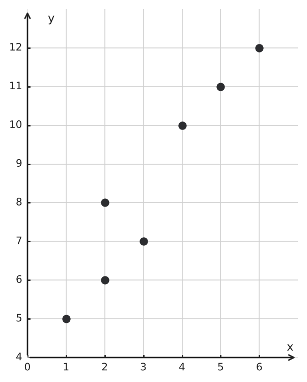
The scatter plot shows an approximately linear pattern. Which point would best continue the pattern: \((8, 10)\), \((8, 18)\), \((8, 26)\), or \((8, 32)\)?
Figure for problem 549999

Hints

- Estimate where the main pattern would be at the given \(x\)-value. - Choose the point nearest the continuation of the trend.

Solution

1. As \(x\) increases by about \(1\), the plotted \(y\)-values increase by about \(3\). 2. Extending that pattern to \(x=8\) gives a \(y\)-value near \(26\). 3. The point that best continues the pattern is \((8, 26)\).

Answer

\((8, 26)\).
5500008
How would removing the point \((7, 2)\) from the scatter plot most likely affect the strength and direction of the association?
Figure for problem 550000

Hints

- Consider how tightly the remaining points would follow the main pattern. - Consider strength and direction separately.

Solution

1. The point \((7, 2)\) lies far below the main upward pattern. 2. Removing it leaves the other points much more tightly grouped around an upward line. 3. The association would remain positive and would appear stronger.

Answer

The association would remain positive and would appear stronger.
5500068
Describe the direction, form, and strength of the association in the scatter plot. Explain what “perfect” adds to the description.
Figure for problem 550006

Hints

- Use the sign of the line’s slope for direction. - Compare an exact line with a cloud that only lies near a line.

Solution

1. The positive slope gives a positive direction. 2. All points lie on one straight line, so the form is linear. 3. “Perfect” means there is no scatter away from that line.

Answer

A perfect positive linear association; every point lies exactly on the same increasing line.
5500088
Which description best fits the scatter plot: no association, positive linear association, or positive nonlinear association? Explain.
Figure for problem 550008

Hints

- Look at the overall direction and the changing rate separately. - A pattern that levels off is not well represented by one straight line.

Solution

1. Larger \(x\)-values generally correspond to larger \(y\)-values, so the direction is positive. 2. The amount of increase becomes smaller as \(x\) grows. 3. The leveling pattern is curved, so the association is nonlinear.

Answer

Positive nonlinear association.
5500098
The scatter plot compares students' daily screen time and nightly sleep. Write a complete description using both direction and strength.
Figure for problem 550009

Hints

- Describe where the center of the cloud moves from left to right. - Use the spread around the trend to describe strength.

Solution

1. The cloud falls from left to right, so the direction is negative. 2. The points are not tightly concentrated around a single line. 3. The plot shows a moderate negative association between screen time and sleep.

Answer

The plot shows a moderate negative association between daily screen time and nightly sleep.
5500148
What association should be reported for the scatter plot?
Figure for problem 550014

Hints

- Imagine a vertical slice at several \(x\)-values and compare the \(y\)-values present. - A filled region does not necessarily show a directional pattern.

Solution

1. At both small and large \(x\)-values, the plot contains a broad range of \(y\)-values. 2. The cloud has no upward, downward, or curved concentration. 3. Report no clear association.

Answer

No clear association.
5500188
A student reports, “The association is positive because every point is higher than the point immediately before it.” Explain why this is not the correct requirement for positive association.

Hints

- Focus on the cloud’s general direction rather than local exceptions. - Association language allows natural scatter.

Solution

1. Positive association describes an overall tendency, not a point-by-point increase. 2. Some points may fall below nearby points while the cloud still rises overall. 3. The student’s condition is too strict.

Answer

A positive association requires an overall upward tendency, not that every successive point has a larger \(y\)-value.
5501448
The table gives paired data for four students. <table><tr><th>Student</th><th>Practice time (hr)</th><th>Score (%)</th></tr><tr><th>A</th><td>\(1\)</td><td>\(60\)</td></tr><tr><th>B</th><td>\(2\)</td><td>\(75\)</td></tr><tr><th>C</th><td>\(3\)</td><td>\(65\)</td></tr><tr><th>D</th><td>\(4\)</td><td>\(85\)</td></tr></table> Which scatter plot correctly represents the paired data, a) or b)? Explain how you checked the pairing.
Figure for problem 550144

Hints

- Turn each row of the table into one ordered pair before comparing the plots. - Check coordinates point by point; having the same x-values and y-values is not enough if they are paired differently. - Keep each student's practice time connected to that same student's score.

Solution

1. Each row of the table gives one ordered pair: \((1, 60)\), \((2, 75)\), \((3, 65)\), and \((4, 85)\). 2. Plot a) contains exactly those four ordered pairs. 3. Plot b) uses the same four score values but attaches them to different practice times, so it does not preserve the student pairings.

Answer

Plot a). It contains \((1, 60)\), \((2, 75)\), \((3, 65)\), and \((4, 85)\), matching the four table rows.
5499888
The scatter plot shows two visible groups of points. Give one reasonable explanation for the two clusters without claiming that the graph proves the explanation.
Figure for problem 549988

Hints

- Ask what unrecorded category might divide the observations into groups. - Use cautious language because the plot does not identify the group labels.

Solution

1. One cluster is near lower \(x\)- and \(y\)-values, and the other is near higher \(x\)- and \(y\)-values. 2. A third categorical factor could separate the observations into two groups. 3. For example, the data could come from two different grade levels, but the plot alone does not prove that explanation.

Answer

A reasonable explanation is that the observations come from two groups, such as two grade levels. The scatter plot suggests this possibility but does not prove it.
5499908
The point \((10, 20)\) is farther right than every other point. Is it necessarily an outlier? Use the pattern in the scatter plot to justify your answer.
Figure for problem 549990

Hints

- Separate “far from the center” from “far from the relationship.” - Compare the point with the continuation of the main trend.

Solution

1. The main points follow approximately \(y=2x\). 2. At \(x=10\), that pattern gives \(y=20\). 3. The point has an extreme \(x\)-value but follows the relationship, so it is not an outlier to the association.

Answer

No. It has an extreme \(x\)-value, but it lies on the same pattern as the other points.
5499918
A data set pairs each student’s hours of sleep with that same student’s reaction time. A classmate sorts the sleep values from least to greatest but leaves the reaction-time values in their original order before plotting. Explain why the new scatter plot cannot be used to study the original association.

Hints

- Think about what one point is supposed to represent. - Check whether both coordinates still come from the same individual.

Solution

1. Each point must contain two measurements from the same student. 2. Sorting only one list changes which reaction time is paired with each sleep value. 3. The new points represent invented pairings, so their association does not describe the original data.

Answer

The one-to-one pairings were destroyed, so the new plot does not represent the original bivariate data.
5499948
The scatter plot has a moderately strong positive linear association. Which added point would weaken that association the most: \((9, 10)\), \((9, 9)\), \((9, 2)\), or \((5, 5)\)? The current trend is close to \(y=x\).
Figure for problem 549994

Hints

- Compare each proposed point with the existing overall pattern. - A point far from the trend usually weakens the association more than a point near it.

Solution

1. Points near \(y=x\) continue the positive linear pattern. 2. At \(x=9\), the trend predicts a \(y\)-value near \(9\). 3. The point \((9, 2)\) is farthest from that trend and would weaken the association most.

Answer

\((9, 2)\).
5499958
A scatter plot of distance in miles and the same distances in kilometers has a perfect positive linear association. If the kilometer values are replaced by meters, what happens to the direction, form, and strength of the association?

Hints

- Consider whether multiplying every value by the same positive number changes their order. - Separate the appearance of the scale from the underlying relationship.

Solution

1. Converting kilometers to meters multiplies every \(y\)-value by \(1000\). 2. Positive scaling preserves the order and exact straight-line relationship, so the association remains perfect, positive, and linear.

Answer

It remains a perfect positive linear association.
5499968
A scatter plot has a positive association. Every \(y\)-coordinate is replaced by its opposite. What happens to the association's direction?

Hints

- Visualize reflecting the point cloud across the x-axis. - Track what happens to high and low \(y\)-values.

Solution

1. Replacing \(y\) by \(-y\) reflects every point across the x-axis, so higher original \(y\)-values become lower transformed \(y\)-values. 2. Therefore, the positive association becomes negative.

Answer

The direction changes from positive to negative.
5500018
Compare the two scatter plots. Which plot has the stronger negative association? Explain why having more points does not necessarily mean a stronger association.
Figure for problem 550001

Hints

- Compare how closely the points in each plot follow a downward pattern. - Judge strength from the spread around the trend, not from the number of observations.

Solution

1. Both plots have an overall downward direction. 2. The points in plot a) stay much closer to a straight downward pattern. 3. Plot b) contains more points, but they are spread farther from its trend. Therefore, plot a) has the stronger negative association.

Answer

Plot a) has the stronger negative association. Its points follow a downward linear pattern more closely, even though plot b) contains more points.
5500028
A scatter plot appears to contain only \(7\) points, but the data file contains \(10\) observations. Give a mathematically valid reason this could happen.

Hints

- Remember that one visible location can represent more than one observation. - Check whether scatter plots display frequency when points coincide.

Solution

1. Different observations can have identical ordered pairs, which are plotted at exactly the same location. 2. Several points may therefore overlap, hiding the full frequency.

Answer

Some observations may have identical ordered pairs, so their points overlap.
5500038
A scatter plot shows that schools with more students tend to have more library books. Give a plausible third variable that could help explain the association, and state why the graph alone does not prove that enrollment causes the number of books.

Hints

- Think of a factor that might increase with both recorded variables. - Use the distinction between an observed pattern and a controlled cause.

Solution

1. Larger schools may have larger budgets or larger buildings. 2. Either factor could be related to both enrollment and the number of books. 3. The scatter plot shows association only and does not isolate cause and effect.

Answer

A plausible third variable is school budget. The plot shows association, but it does not prove that enrollment itself causes the book count.
5500048
A principal sees a positive association between attendance and test score and says, “Increasing any student’s attendance by one day will always increase that student’s score.” What is wrong with this conclusion?

Hints

- Distinguish a general tendency from a rule that applies without exception. - Ask whether the graph controls all other factors that affect the score.

Solution

1. A scatter plot summarizes a tendency across many students. 2. Individual points do not follow an exact rule. 3. Association does not guarantee a fixed change for every individual or prove causation.

Answer

The plot shows an overall association, not an exact cause-and-effect rule for every student.
5500078
The scatter plot has no obvious outliers. Must its association be strong? Explain using the overall point cloud.
Figure for problem 550007

Hints

- Judge how tightly the entire cloud follows one pattern. - Absence of an isolated point does not guarantee that the remaining points are close to a line.

Solution

1. The points have a slight upward tendency, but they form a broad cloud rather than staying close to one line. 2. Strength depends on how tightly all the points follow a pattern, not only on whether one point is unusually far away. 3. Therefore, the association is weak to moderate even though there is no obvious outlier.

Answer

No. The broad point cloud shows only a weak to moderate positive association, even though there is no obvious outlier.
5500108
Describe the overall direction of the association and how the vertical spread changes as \(x\) increases.
Figure for problem 550010

Hints

- Describe the location of the cloud and its width as separate features. - Compare the range of \(y\)-values on the left and right sides.

Solution

1. The center of the point cloud rises as \(x\) increases, indicating positive association. 2. The points are close together at small \(x\)-values and farther apart at large \(x\)-values. 3. The plot has a positive association with increasing vertical spread.

Answer

The plot has a positive association, and the vertical spread grows as \(x\) increases.
5500118
Plots a) and b) show the same paired data with different x-axis scales. Explain how the scale changes the appearance and what remains unchanged.
Figure for problem 550011

Hints

- Compare the x-axis ranges before comparing the shapes of the point clouds. - Distinguish changes in the viewing window from changes in the ordered pairs.

Solution

1. Plot a) uses a much wider x-axis range, so the x-values are compressed into a narrow part of the display. 2. Plot b) uses a range close to the data values, so the horizontal differences are easier to see. 3. The apparent steepness and spread change, but the ordered pairs and their underlying positive association remain unchanged.

Answer

The wider scale in plot a) compresses the points horizontally, while plot b) spreads them out. The visual appearance changes, but the paired data and positive association do not.
5500128
The \(y\)-values in a data table increase by about \(2\), then \(4\), then \(6\), then \(8\) as \(x\) increases by equal amounts. What does this suggest about a scatter plot of the data?

Hints

- Compare changes in \(y\) over equal changes in \(x\). - A straight pattern would have approximately constant vertical change.

Solution

1. Equal increases in \(x\) do not produce roughly equal increases in \(y\). 2. The increases in \(y\) become larger. 3. The scatter plot would likely show an upward-curving nonlinear association.

Answer

It suggests a positive nonlinear association that becomes steeper.
5500138
For each ordered pair, the \(x\)-value is the number of pages in a book and the \(y\)-value is the book's price. The points form two clusters. What information should be checked before concluding that one cluster consists of hardcover books and the other of paperback books?

Hints

- A visual grouping suggests a question but does not supply category labels. - Identify the additional categorical data needed to test the explanation.

Solution

1. The cluster pattern alone does not label the groups. 2. The binding type for each book must be recorded and matched to the plotted point. 3. Only then can the proposed explanation be checked.

Answer

Check the actual binding type for each plotted book and see whether it matches the two clusters.
5500158
A data-entry error changed the point \((6, 14)\) to \((60, 14)\). The original data followed a positive linear pattern. Explain how correcting the error is likely to affect the scatter plot.

Hints

- Compare where the mistyped and corrected points lie relative to the main trend. - A single place-value error can create an artificial outlier.

Solution

1. The incorrect point is far to the right while keeping a moderate \(y\)-value, so it conflicts with the positive pattern. 2. Correcting \(60\) to \(6\) returns the point near the main cloud. 3. The corrected plot will likely show a stronger positive linear association.

Answer

Correcting the point will likely strengthen the positive linear association.
5500178
Is “negative nonlinear association” a reasonable description of the scatter plot? Explain.
Figure for problem 550017

Hints

- Compare the y-values near the left and right ends to identify the overall direction. - Decide whether one straight band captures the shape through the middle.

Solution

1. The points move downward overall as \(x\) increases, so the direction is negative. 2. The pattern decreases, levels off, and then decreases again, so one straight line does not describe it well. 3. Therefore, “negative nonlinear association” is reasonable.

Answer

Yes. The overall direction is negative, and the leveling section makes the pattern nonlinear.
5500198
The medians of \(y\) in four equal-width \(x\)-bands are \(12\), \(18\), \(25\), and \(31\). What direction of association do these summaries suggest? State one limitation of using only these medians.

Hints

- Track how the typical \(y\)-value changes across the \(x\)-bands. - Ask what information one summary number per band leaves out.

Solution

1. The typical \(y\)-value increases from one \(x\)-band to the next. 2. This suggests positive association. 3. The medians do not show the spread, clusters, or outliers within each band.

Answer

They suggest positive association, but they hide the within-band spread and unusual points.
5500208
The scatter plot compares weekly practice hours and skill ratings. Give a complete description using direction, clusters, and unusual features.
Figure for problem 550020

Hints

- Describe the dominant pattern first. - Then name any grouping or point set that does not belong to that pattern.

Solution

1. The main cluster follows a positive pattern. 2. A smaller cluster lies in a different region of the graph. 3. The complete description should mention both the positive association in the main group and the separate cluster.

Answer

The main cluster has a positive association, with a separate small cluster at high practice-hour values and low skill ratings.
5500218
A classmate describes the scatter plot of bicycle speed and stopping distance only as “positive.” Improve the description so it includes the important form of the pattern.
Figure for problem 550021

Hints

- Add information about shape, not only direction. - Compare equal increases in speed at the low and high ends.

Solution

1. Stopping distance generally increases as speed increases, so the direction is positive. 2. The increases become larger at higher speeds. 3. The improved description is a positive nonlinear association that becomes steeper.

Answer

A positive nonlinear association that becomes steeper as speed increases.
5500228
A research team plots arm span against height and sees one point far from the main pattern. Before labeling the person “unusual,” list two data checks the team should make.

Hints

- Separate possible recording problems from genuine variation. - Check both the values and the pairing.

Solution

1. Verify that both measurements were recorded correctly and use the same units as the other data. 2. Verify that the arm span and height belong to the same person. 3. Only after these checks should the point be interpreted as a genuine outlier.

Answer

Check the measurements and units, and confirm that the two values were paired for the same person.
5500248
The scatter plot compares practice hours with the number of errors on a task. Write one complete sentence that addresses direction, form, strength, and an unusual feature.
Figure for problem 550024

Hints

- Use a checklist: direction, shape, tightness, and unusual points. - Base the description on the whole cloud before mentioning the exception.

Solution

1. As practice hours increase, the number of errors generally falls, so the direction is negative. 2. It stays fairly close to a straight band, so it is a strong linear pattern. 3. The point near \((6, 9)\) lies far above the band and is an outlier.

Answer

The plot shows a strong negative linear association between practice hours and errors, with an outlier near \((6, 9)\).
5500058
The scatter plot compares practice sessions and skill scores for a group of students. Describe the overall pattern and the pattern within each cluster.
Figure for problem 550005

Hints

- Describe the pattern at two scales: between groups and inside each group. - Do not assume the overall trend must also appear within every cluster.

Solution

1. The cluster centers rise from left to right, giving an overall positive association. 2. Within each cluster, the points show little or no association. 3. The grouping structure is important to the interpretation.

Answer

Overall, the plot has a positive association, but within each cluster there is little or no association.
5500168
Compare plots a) and b). Which plot has the stronger association, and which has the more linear association?
Figure for problem 550016

Hints

- Do not use “strong” and “linear” as synonyms. - Judge closeness to a pattern separately from the shape of that pattern.

Solution

1. Tightness to any clear pattern determines strength, so plot a) is stronger. 2. Straightness determines linearity, so plot b) is more linear. 3. Strength and linearity describe different features.

Answer

Plot a) has the stronger association; plot b) has the more linear association.
5500238
Plots a) and b) begin with the same positive point cloud. Each plot includes one added point marked with a cross. Explain why the added point strengthens the association in a) but weakens it in b).
Figure for problem 550023

Hints

- Compare each crossed point with the direction of the original cloud. - Being far from the center is not enough; decide whether the point supports or opposes the trend.

Solution

1. In plot a), the added upper-right point extends the existing positive tendency. 2. In plot b), the added lower-right point pairs a large \(x\)-value with a small \(y\)-value, opposing the tendency. 3. An extreme point can strengthen or weaken an association depending on its position relative to the existing pattern.

Answer

The added point in a) supports and extends the positive trend, while the added point in b) contradicts it.

All problems may be used, copied and printed free of charge for school and tutoring, including paid tutoring. Commercial adaptations as well as publication or redistribution on the internet are not permitted.